Skip navigation

Official websites use .gov
A .gov website belongs to an official government organization in the United States.

Secure .gov websites use HTTPS
A lock ( ) or https:// means you’ve safely connected to the .gov website. Share sensitive information only on official, secure websites.

URL of this page: https://medlineplus.gov/webeval/conclusion1.html

Evaluating Internet Health Information Tutorial

Previous Page
Next Page

Conclusion—Part 1 of 2

The Internet provides you with quick access to health information. But you need to be able to tell the difference between the good sites and the bad.

Let's review the clues to quality by looking at our two fictional websites.

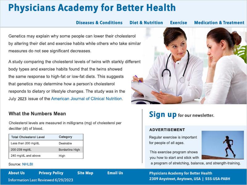
The site for the Physicians Academy for Better Health:

  • Is managed by health care experts
  • Has a clearly stated purpose to educate the public on disease prevention and healthy living
  • Labels advertising
  • Reviews health information before posting it
  • Explains the sources of data and research
  • Is up to date
  • Will not share personal information
Screenshot of the PABH homepage. It includes a horizontal menu to navigate the site, the sources for health content are clearly indicated with links, an advertisement is clearly labeled, and the footer area contains links to 'About Us', 'Privacy Policy', 'Site Map', and 'Email Us' pages. The last reviewed date and contact information is also available in the footer.
The Physicians Academy for Better Health is an example of a website that clearly labels where you'll find the information you need to decide on the quality of the site.


The site for the Institute for a Healthier Heart:

  • Does not tell you who is managing it
  • May have information that favors its sponsor
  • Has an unclear purpose, but appears to be about selling products that claim to help your heart
  • Does not label advertising
  • Does not describe how information is chosen
  • Does not identify the sources of information
  • Does not tell how old the information is
  • May include misinformation
  • Might share your personal information with others
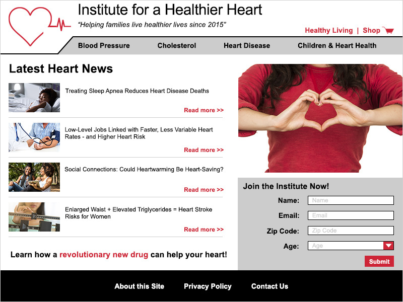
Screenshot of the IHH homepage. A red shopping cart logo is at the top of the page above the horizontal menu for navigation of the site. An unlabeled ad is directly underneath the page's health content, making it hard to tell which is the ad. A form is in the lower right corner of the home page asking for personal identifiable information. The footer has links to the 'About this Site', 'Privacy Policy', and 'Contact Us' pages.
The example of the Institute for a Healthier Heart may look like a good site at first. But if you look closer, you won't find the facts you need to evaluate the quality of their information - and that's a big clue that the information may not be reliable.


Which website will you trust?

Previous Page
Next Page